
Lab Group: Steffen Seamon, Simon Cohen
Date of Inquiry: 10-18-18
Capitalocene Lab Week 8
Background
The purpose of this lab was to further our understanding of the capitalocene through spatial analysis of statistics we perceived as being indicative of the relationship between capitalism and the natural world. As we saw in Against the Anthropocene by Daniel Hartley, the capitalocene is an alternative to the anthropocene that emphasizes capitalism as the driving force behind how humans have affected the Earth in the modern age. Last week, we compared countries using Yale’s Environmental Performance Indicators (EPI) with two statistics, income group and region, from the World Bank. Hartley would have led us to believe that the wealthiest countries would be the most exploitative of their natural resources. Our analysis did not necessarily agree with this. Across all regions, the world’s wealthiest nations had the highest EPI scores, meaning that those nations have the least negative effect on their environments. This could be potentially be because wealthy nations have the capital to reverse some of the negative environmental effects of industrializing over the course of the 20th century. This week, I wanted to look more into World Bank indicators related to industry. This helped further investigate some of the effects of the capitalocene. I chose to look at the value added from industry (including construction) to countries and renewable energy consumption as a percentage of total energy consumption. Industry value indicates the presence and need for a number of things that can lead to environmental degradation, like factories and sites for exploiting fossil fuels. Renewable energy consumption can show a country’s ability to industrialize without using more damaging energy sources.
Procedure
First, I selected two more indicators (value added from industry (including construction) to countries and renewable energy consumption as a percentage of total energy consumption) from the World Bank. Then, I added these to my spreadsheet from last week’s lab. Then we added 2 digit ISO codes to our spreadsheets so we could map our data using ArcGIS Online. Then, we imported our data in ArcGis online and created maps comparing EPI scores and World Bank indicators.
Results
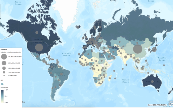
Map displaying EPI score (shade) and industry value added in 2010 US$ (circle)
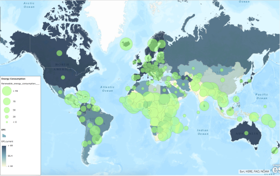
Map displaying EPI score (shade) and renewable energy consumption as a percentage of total energy consumption (circle)
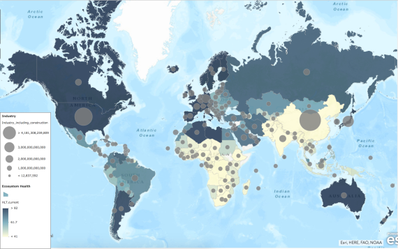
Map displaying ecosystem health score (shade) and industry value added in 2010 US$ (circle)
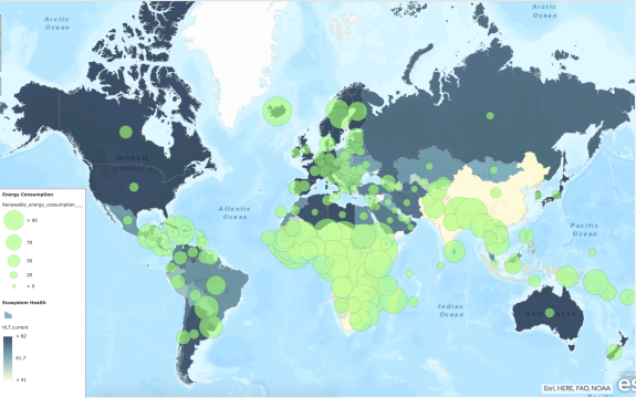
Map displaying ecosystem health score (shade) and renewable energy consumption as a percentage of total energy consumption (circle)
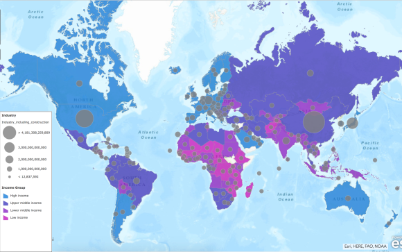
Map displaying income group (shade) and industry value added in 2010 US$ (circle)
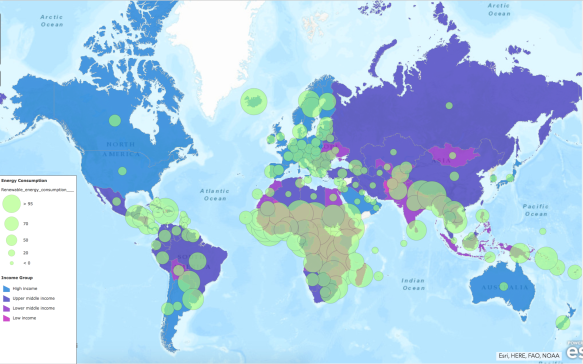
Map displaying income group (shade) and renewable energy consumption as a percentage of total energy consumption (circle)
The first pair of graphs analyze the relationships between a country’s EPI score and their value added from industry or their consumption of renewable energy as a percentage of their total energy use. For much of the world, the industry value and renewable energy consumption look like inverses of each other. However, neither follow too closely with EPI score.
The second pair analyzes the relationships between a country’s ecosystem vitality score and their value added from industry or their consumption of renewable energy as a percentage of their total energy use.These graphs look very similar to the last two since a country’s ecosystem vitality score closely followed their EPI score.
The third pair analyzes the relationships between a country’s income group and their value added from industry or their consumption of renewable energy as a percentage of their total energy use. This varied quite a lot, but overall it appeared that low income countries did not gain much value from industry. Renewable energy consumption did not seem to follow income group, instead it seemed to be more connected to where a country is situated geographically.
Discussion
Last week, we compared income group and region with a country’s EPI score and ecosystem vitality and health scores. This week, we plotted the data we analyzed last week on a map of the world and also added a country’s value added from industry and renewable energy consumption as a percentage of total energy use, which we obtained from the World Bank. It does not seem that there is a strong trend relating these two new statistics with any of the ones we analyzed last week. Overall, it seems like countries with higher overall EPI scores also have higher value added from industry, except there are outliers like China. This does not support the theory of the capitalocene as this would suggest that some of the countries that benefit most from industry also do the least damage to their environments. Renewable energy consumption follows a spatial trend. Central America, Africa, Europe, and Southeast Asia all have high percentages of renewable energy consumption. There is not much that links these countries from the other indicators that I looked at. These maps are not doing much to refute or support the theory of the capitalocene.
